


SUMMARY: From concept to construction—an end-to-end branding and environment design for a new café and restaurant experience.
CHALLENGE
Create an entirely new hospitality brand from scratch—one that would resonate with both locals and travelers. The scope extended far beyond a logo: Portside needed a full visual identity, an inviting retail space, and a clear point of view that translated across digital, physical, and environmental touchpoints.
Create an entirely new hospitality brand from scratch—one that would resonate with both locals and travelers. The scope extended far beyond a logo: Portside needed a full visual identity, an inviting retail space, and a clear point of view that translated across digital, physical, and environmental touchpoints.
SOLUTION
I led the holistic brand development of Portside, starting with a custom wordmark and logo system that informed everything from packaging to signage. I crafted a unique typographic style and color palette rooted in the brand’s coastal inspiration. In parallel, I designed the physical space—selecting finishes, creating branded menu boards and signage, managing the interior buildout, and coordinating with contractors and vendors to ensure brand integrity from blueprint to grand opening.
I led the holistic brand development of Portside, starting with a custom wordmark and logo system that informed everything from packaging to signage. I crafted a unique typographic style and color palette rooted in the brand’s coastal inspiration. In parallel, I designed the physical space—selecting finishes, creating branded menu boards and signage, managing the interior buildout, and coordinating with contractors and vendors to ensure brand integrity from blueprint to grand opening.
OUTCOME
Portside launched as a visually cohesive and experientially rich café and restaurant. The brand came to life across physical space, digital menus, printed materials, merchandise, and advertising. Guests experienced a seamless blend of form and function—where every surface, sign, and sip reinforced the story.
Portside launched as a visually cohesive and experientially rich café and restaurant. The brand came to life across physical space, digital menus, printed materials, merchandise, and advertising. Guests experienced a seamless blend of form and function—where every surface, sign, and sip reinforced the story.
REFLECTION
This project was a rare opportunity to build something truly from the ground up. It challenged me to think like a designer, a strategist, and a builder—balancing aesthetics with budget, creativity with logistics. Portside remains one of my most rewarding branding projects because it combined so many disciplines into one unified, living experience.
This project was a rare opportunity to build something truly from the ground up. It challenged me to think like a designer, a strategist, and a builder—balancing aesthetics with budget, creativity with logistics. Portside remains one of my most rewarding branding projects because it combined so many disciplines into one unified, living experience.
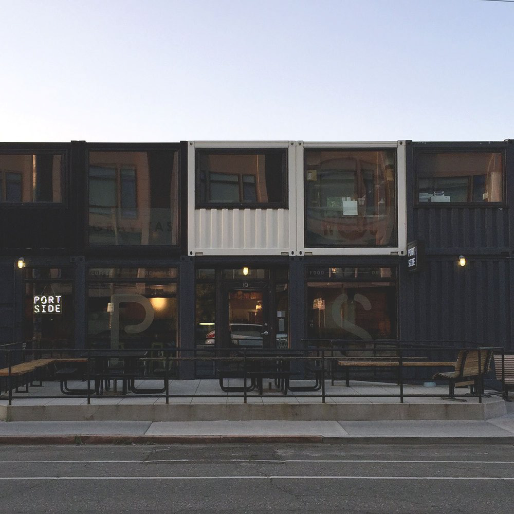
FRONT EXTERIOR DESIGN
This is the front exterior of Port Side. We wanted to maintain the overall drama of the ends of the shipping containers but offset it with large and open windows to allow maximum sunlight. We kept the window vinyl to a minimum to not detract from any visibility when inside the cafe.
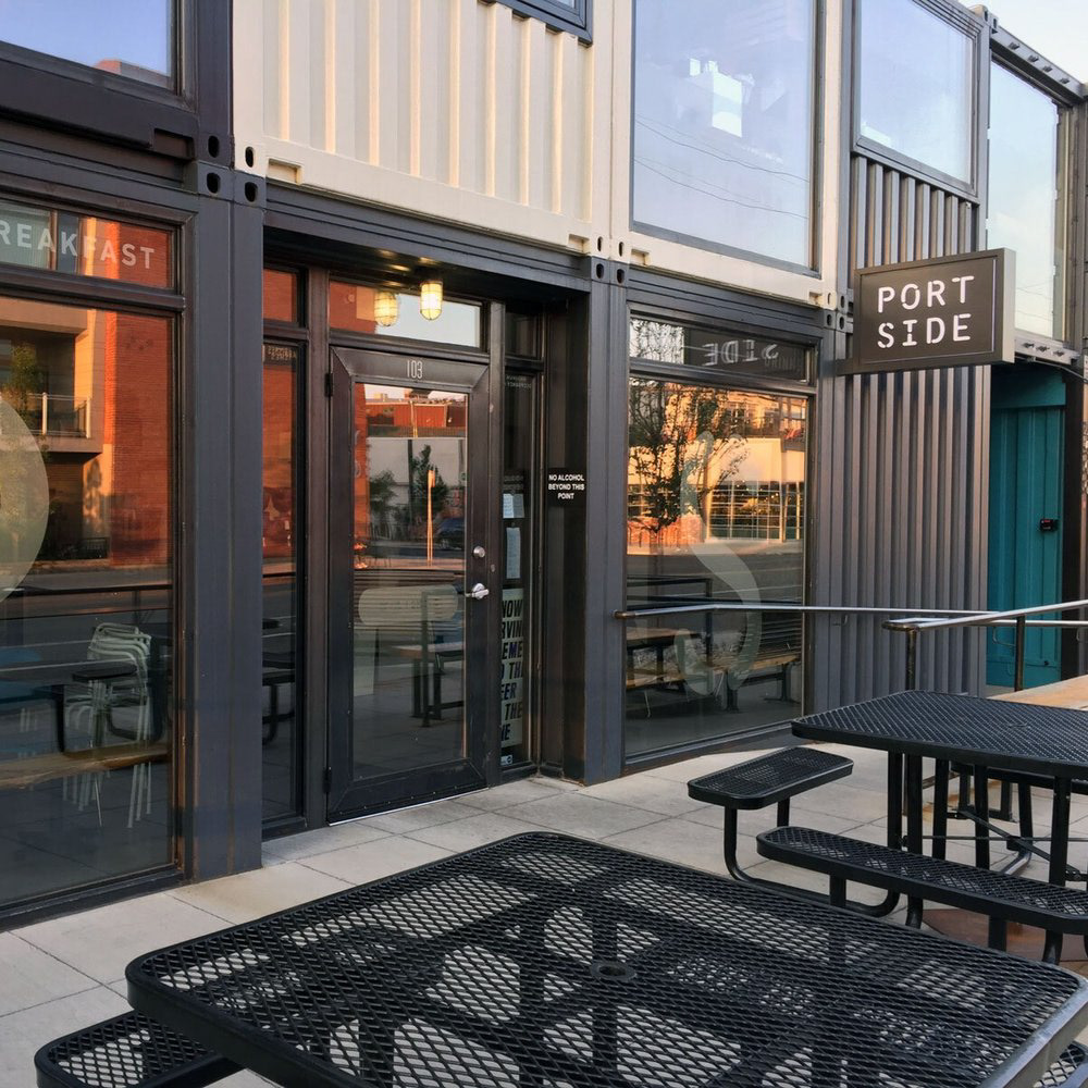
FRONT EXTERIOR & PATIO
This is a close-up view of the window vinyl. We found a see-through vinyl that would be translucent but still visible from the street.
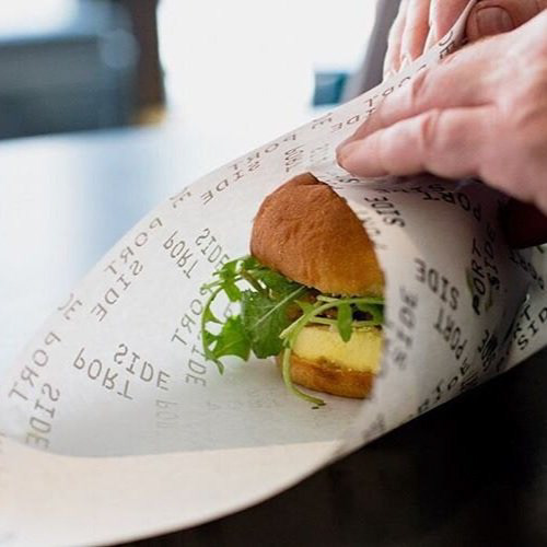
BRAND EXTENSION PIECES
We thankfully had the time and budget to think through all the various brand touchpoints. Customized butcher paper was one of the many opportunities to extend the brand outside the physical cafe space.
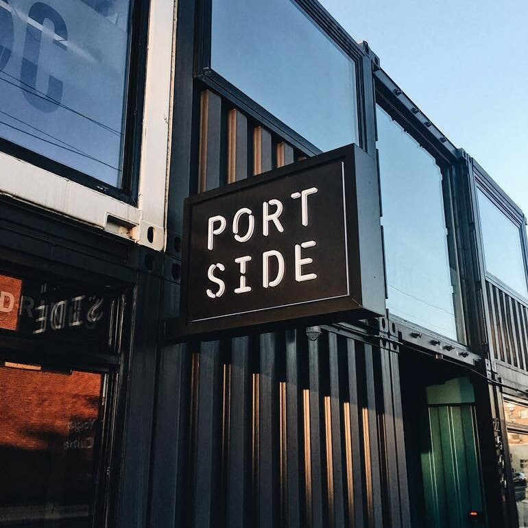
EXTERIOR SIGNAGE
I worked with a local signmaker to produce a blade sign that would be lit at all hours of the day and night for maximum street- and walk-by visibility.
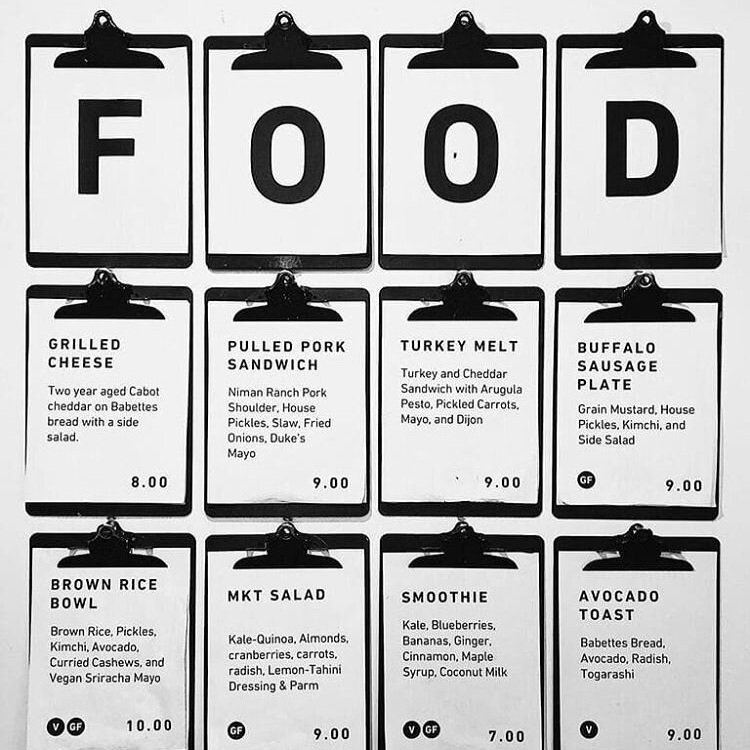
IN-STORE MENUS
Port Side is a restaurant that buys local produce and meat and, because of this, the menu rotates regularly. We wanted something that could get changed out easily but communicated the current offerings in a simple way. I spray-painted several clipboards black and created a templated Google document.
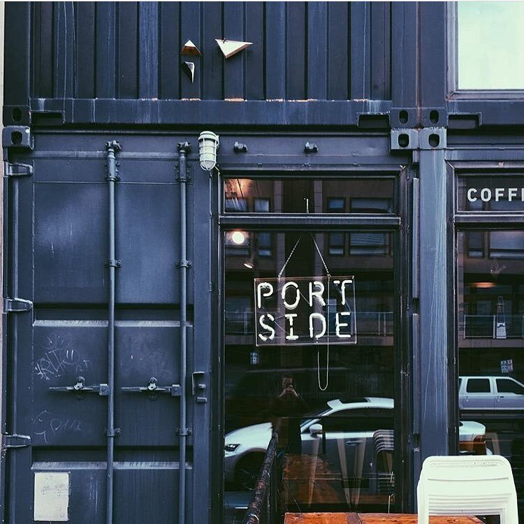
CUSTOM NEON SIGNAGE
Working with a local neon sign maker, I wanted to find something that could be used alternatively to the customary OPEN sign while communicating a similar message.
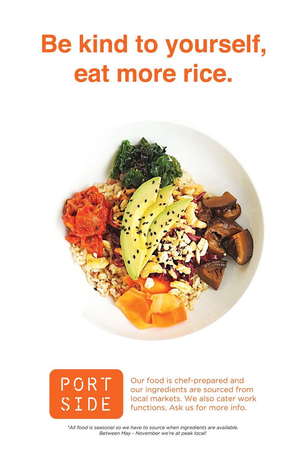
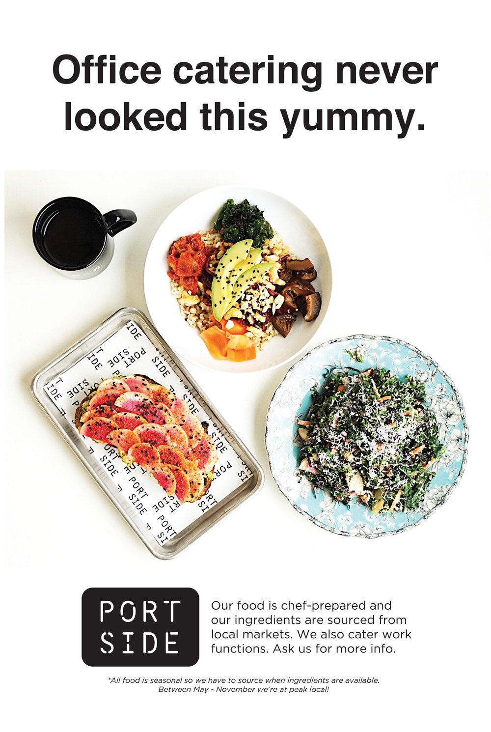
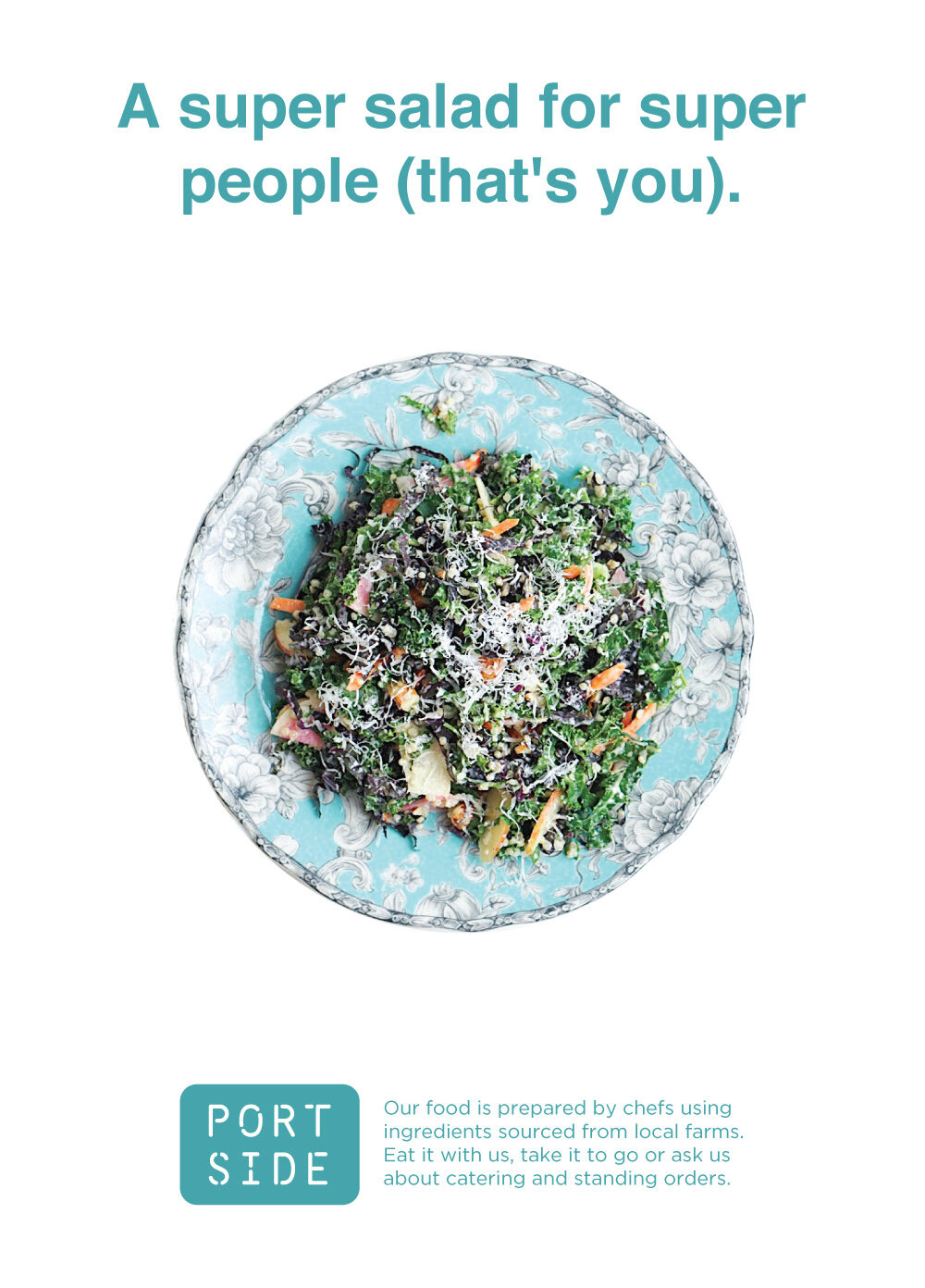
PRINT ADVERTISING
A few months after Port Side opened, I created an advertising campaign that targeted existing customers. Outside of the printed text-based clipboard menus, I wanted to create something that visually communicated Port Side’s other menu items in a clever way.
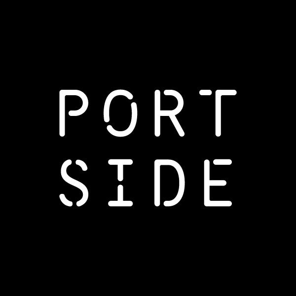
LOGOTYPE DESIGN
I worked with a local type designer to create a custom font for Port Side. I wanted something that paid homage to the loosely nautical theme without being kitschy or obvious. The resulting logotype is legible and strong, just like the shipping container that welcomes hundreds of customers each day.