

SUMMARY: A refreshed brand identity for one of Colorado’s oldest mineral societies, designed to preserve legacy while embracing digital relevance.
CHALLENGE
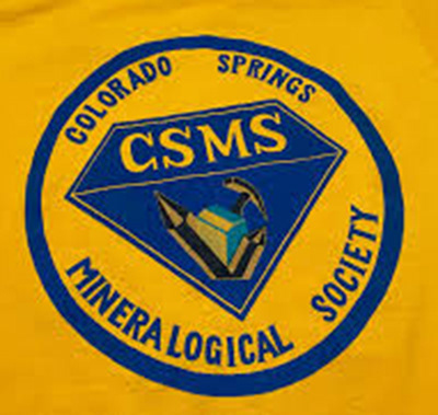
The Colorado Springs Mineralogical Society—one of the state’s longest-running rockhounding clubs—needed a refreshed brand identity. Their legacy logo, while nostalgic, wasn’t optimized for digital use, merchandising, or new member engagement. The challenge was to modernize the look and feel while honoring decades of history and passion for Colorado’s mineral heritage.
The Colorado Springs Mineralogical Society—one of the state’s longest-running rockhounding clubs—needed a refreshed brand identity. Their legacy logo, while nostalgic, wasn’t optimized for digital use, merchandising, or new member engagement. The challenge was to modernize the look and feel while honoring decades of history and passion for Colorado’s mineral heritage.
SOLUTION
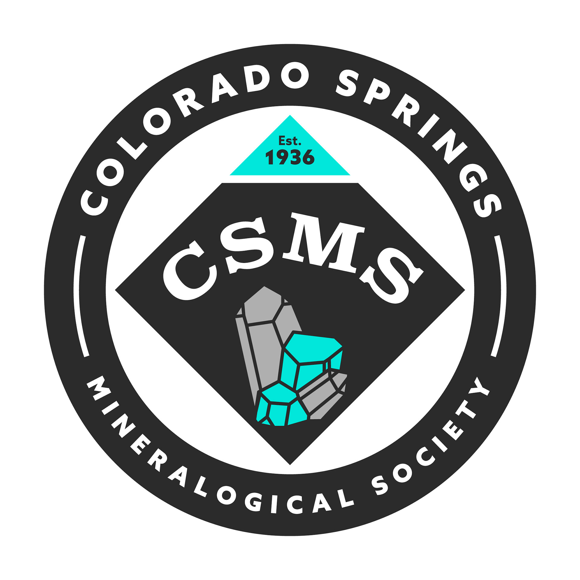
I began by studying the Society’s historic logos and visual artifacts to identify elements worth carrying forward. The new logo introduces a clean, versatile mark built for scalability—from embroidered hats to mobile websites. The outdated orange-and-yellow palette was replaced with a more meaningful color system: aqua blue to represent amazonite and deep grey inspired by smoky quartz—two minerals central to Colorado’s mineralogical identity. Paired with a flexible font system and supporting brand guidelines, the design invites both longtime members and a new generation of enthusiasts to connect with the club.
I began by studying the Society’s historic logos and visual artifacts to identify elements worth carrying forward. The new logo introduces a clean, versatile mark built for scalability—from embroidered hats to mobile websites. The outdated orange-and-yellow palette was replaced with a more meaningful color system: aqua blue to represent amazonite and deep grey inspired by smoky quartz—two minerals central to Colorado’s mineralogical identity. Paired with a flexible font system and supporting brand guidelines, the design invites both longtime members and a new generation of enthusiasts to connect with the club.
OUTCOME
The new logo and brand package were warmly received by the board and community, providing a refreshed sense of pride and unity. The visual update helped reinvigorate outreach efforts, improve online presentation, and set the stage for broader member engagement, fundraising, and educational initiatives.
The new logo and brand package were warmly received by the board and community, providing a refreshed sense of pride and unity. The visual update helped reinvigorate outreach efforts, improve online presentation, and set the stage for broader member engagement, fundraising, and educational initiatives.
REFLECTION
This redesign was as much about preservation as it was innovation. By respecting what made the original identity special while introducing clarity, utility, and deeper symbolism, the new CSMS brand honors its past—and gives it room to grow well into the future.
This redesign was as much about preservation as it was innovation. By respecting what made the original identity special while introducing clarity, utility, and deeper symbolism, the new CSMS brand honors its past—and gives it room to grow well into the future.