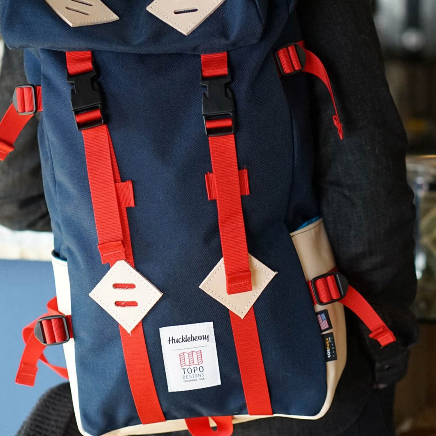
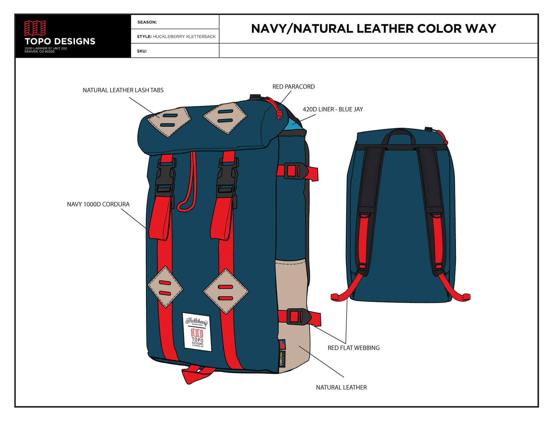
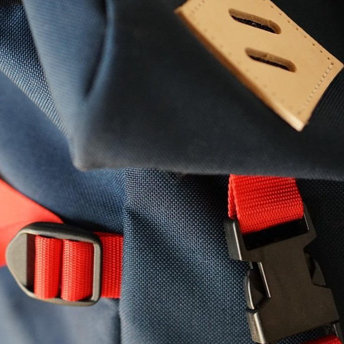
SUMMARY: Led the brand development, retail experience, and wholesale expansion of Huckleberry Roasters, transforming it into a multi-million dollar business with award-winning recognition.
CHALLENGE
In 2011, my co-founder and I set out with a simple idea: build a coffee brand that did more than just serve good coffee—it would foster community, set new standards for quality, and become a trusted name in specialty coffee. With no initial blueprint and minimal resources, the challenge was clear: create a brand from scratch, establish a local footprint, and build a wholesale program that could compete with industry veterans.
In 2011, my co-founder and I set out with a simple idea: build a coffee brand that did more than just serve good coffee—it would foster community, set new standards for quality, and become a trusted name in specialty coffee. With no initial blueprint and minimal resources, the challenge was clear: create a brand from scratch, establish a local footprint, and build a wholesale program that could compete with industry veterans.
SOLUTION
We started with a hands-on approach—sourcing green beans directly, learning the intricacies of roasting, and crafting a brand identity that was both approachable and uncompromising. My role spanned brand development, café design, retail experience, and creative direction. Some key steps included:
We started with a hands-on approach—sourcing green beans directly, learning the intricacies of roasting, and crafting a brand identity that was both approachable and uncompromising. My role spanned brand development, café design, retail experience, and creative direction. Some key steps included:
• Brand Identity: Built a visual identity that captured the spirit of community and quality, reflected in everything from café signage to packaging.
• Café Design & Experience: Designed and launched three distinct café locations, each with its own vibe but tied together through consistent brand storytelling.
• Wholesale Program: Established a wholesale program that grew exponentially, supplying award-winning coffee to restaurants, cafés, and retailers nationwide.
• Digital & Print Collateral: Developed marketing materials, digital content, and packaging that solidified Huckleberry as a recognizable and trusted brand in the specialty coffee space.
• Community Engagement: Focused on fostering local partnerships and hosting events that brought people together over a cup of coffee.
OUTCOME
What started as a grassroots coffee project grew into a multi-million dollar business with:
What started as a grassroots coffee project grew into a multi-million dollar business with:
Three successful café locations that became community hubs in Denver.
An award-winning wholesale program, distributing to over 100 partners nationwide.
National recognition for quality and community focus, leading to features in Sprudge, Barista Magazine, and Thrillist.
A dedicated community of customers who came for the coffee but stayed for the experience.
REFLECTION
Huckleberry Roasters is more than just a brand—it’s a testament to the power of community, good design, and an obsessive commitment to quality. From roasting beans late into the night to designing our first café space, every step of the journey taught me the importance of grit, adaptability, and vision. Most importantly, it showed me that a well-crafted brand is not just seen—it’s felt.
Huckleberry Roasters is more than just a brand—it’s a testament to the power of community, good design, and an obsessive commitment to quality. From roasting beans late into the night to designing our first café space, every step of the journey taught me the importance of grit, adaptability, and vision. Most importantly, it showed me that a well-crafted brand is not just seen—it’s felt.
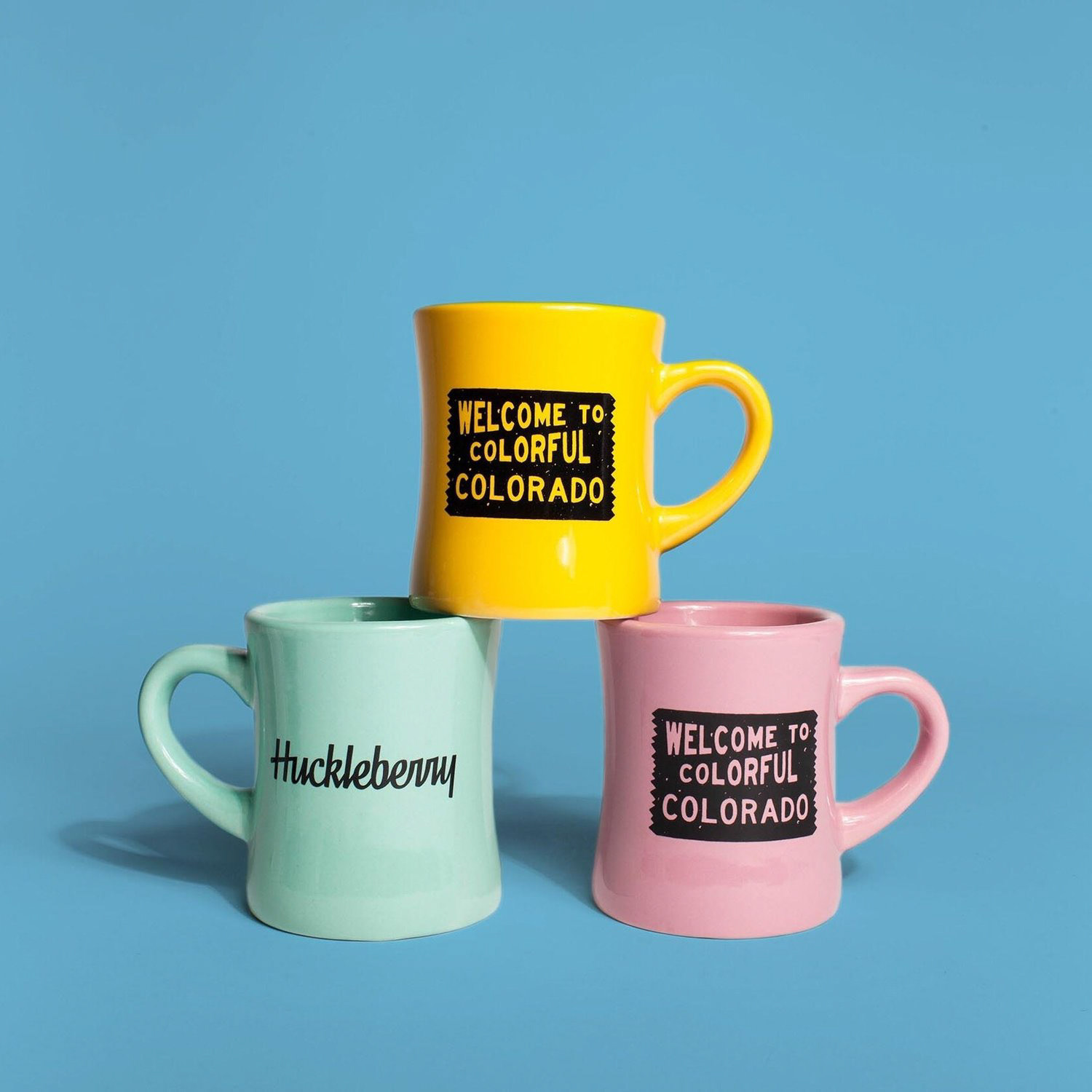
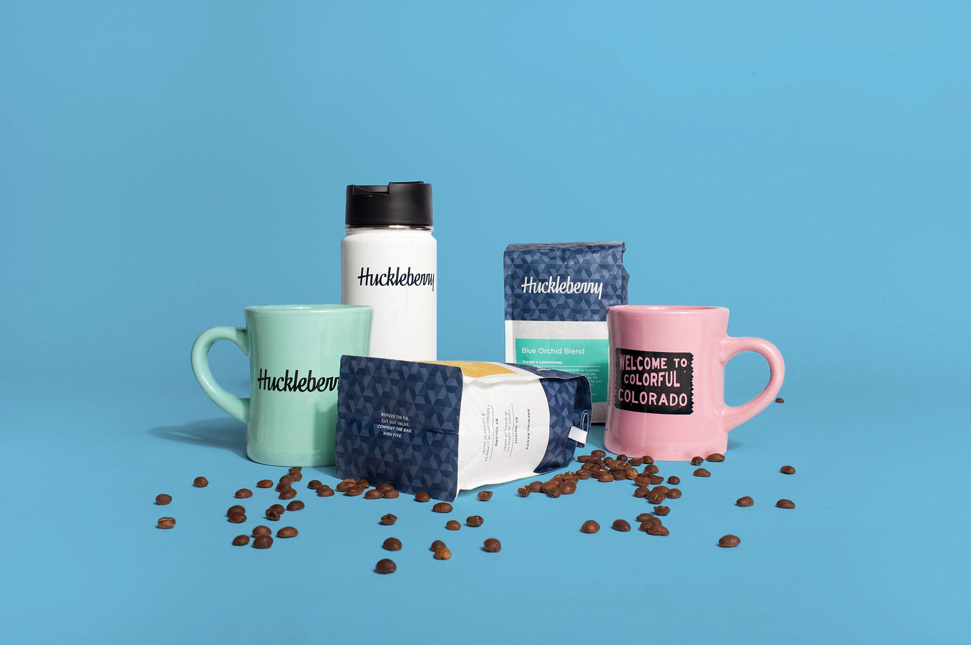
LOGOTYPE REDESIGN
I was responsible for managing the redesign of our main logotype. At the point of this redesign, we had two retail locations, over 50k CPG units, a website, and so many pieces that had our old logo. I managed the successful rollout of this logo in coordination with the phasing out of the old one. We wanted a logotype that was simpler and focused solely on the name HUCKLEBERRY.
Part of the logotype redesign included introducing a logomark. We wanted something that contained our signature H for HUCKLEBERRY but also communicated something deeper. The H horizontal line and circle hide the shape of a coffee bean. This logomark gave us the opportunity to create more merchandise and increase revenue significantly.



BRAND EXTENSION
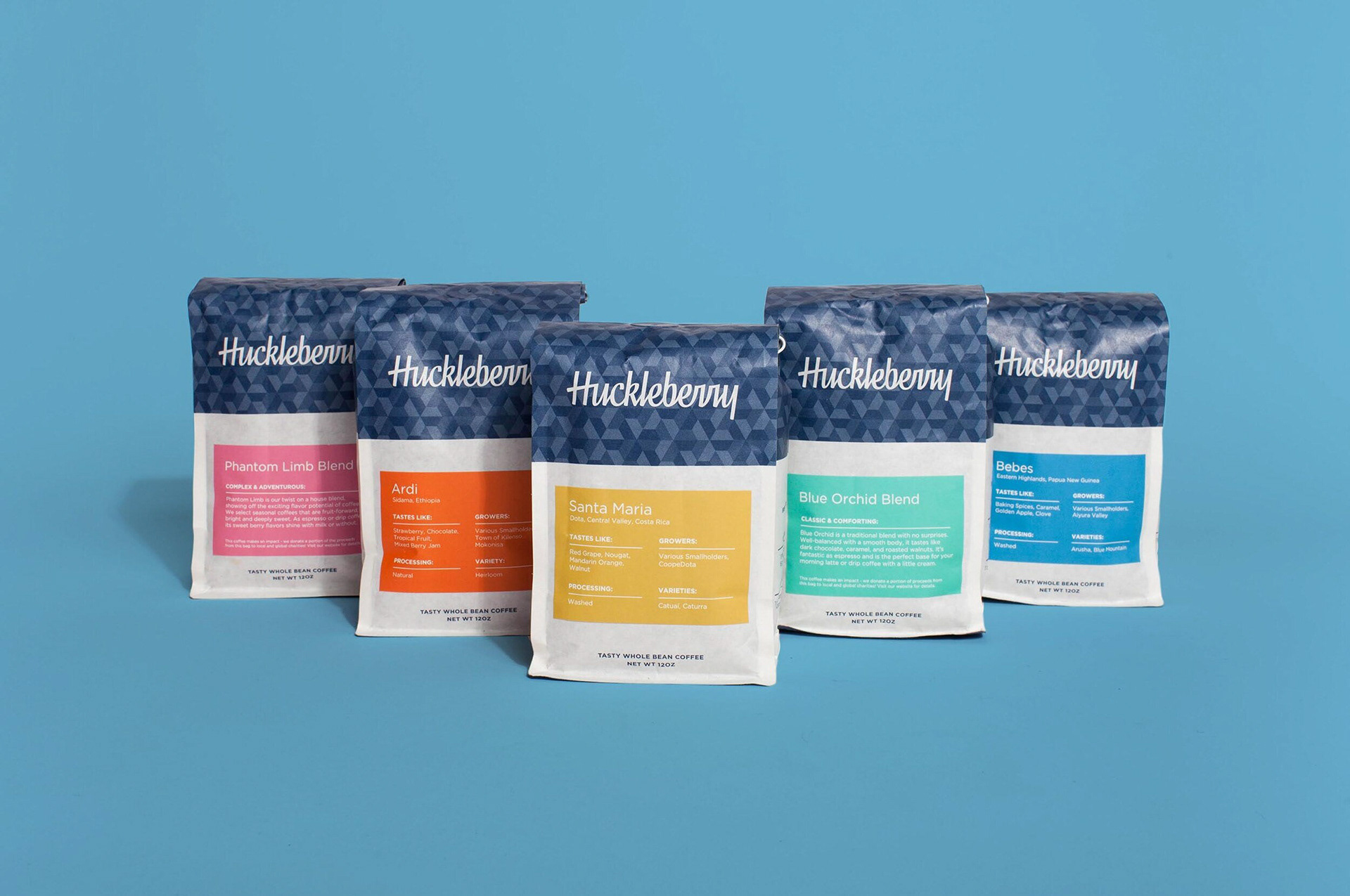
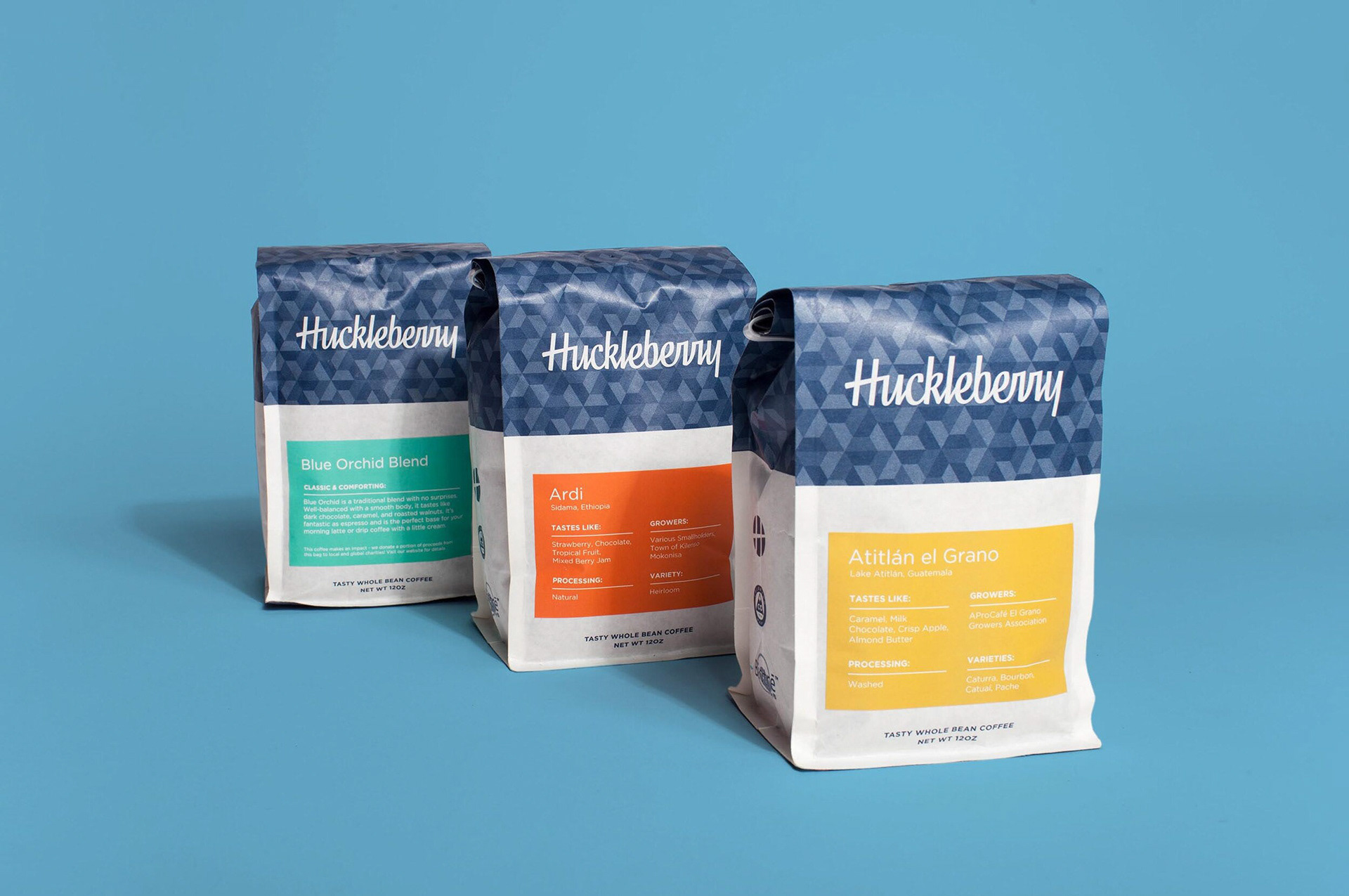
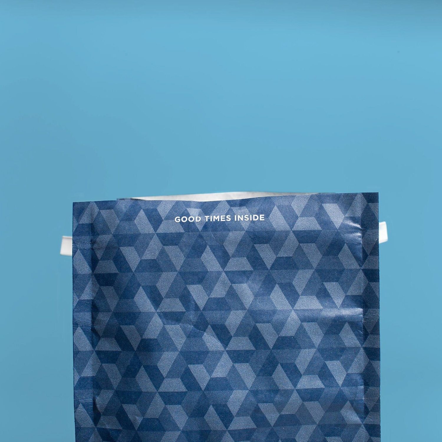
Further building on the brand’s mission of not taking ourselves too seriously, I wanted to find small ways of injecting personality into inanimate objects such as the top of a coffee bag.
I built a pattern that could be used in many different ways down the road. I wanted a three-tone blue pattern that didn’t feel too complex but was still a pretty backdrop to the top third of the retail bag. Future potential uses included the two combined trapezoids representing a coffee bean, extracting various pattern combinations to further denote the coffee’s origin.
